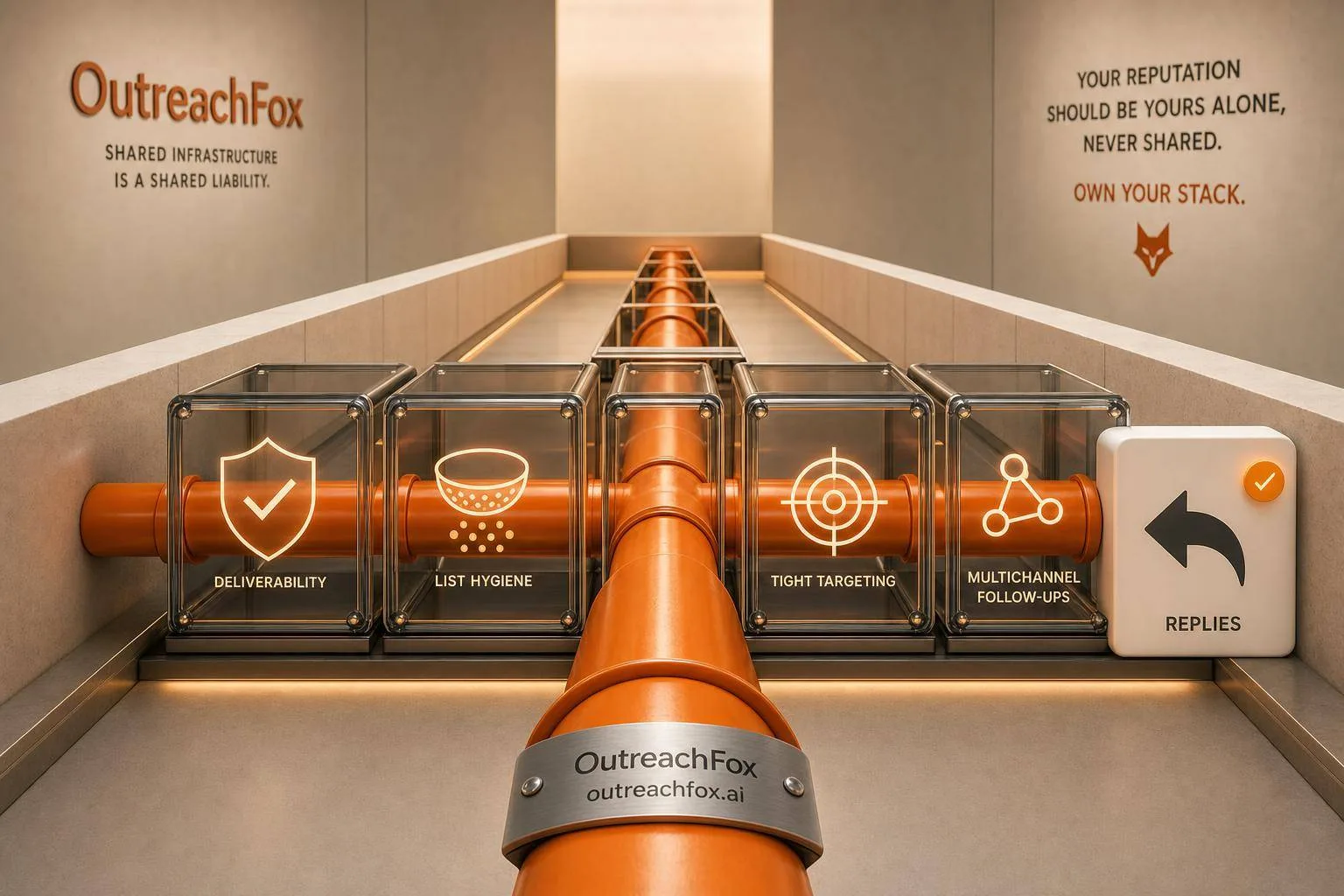
Average cold email reply rates in 2026 land at 3-5%, with top performers exceeding 10%. Most low reply rates stem from deliverability, list quality, targeting, or sequence issues—not copy.
- Reply rates under 2% signal deliverability or list problems, not copy issues.
- Signal-triggered campaigns outperform broad lists by 3-5x in reply rates.
- Send 20-49 emails per mailbox daily to maintain a 5.7% reply rate.
- Verified lists generate roughly 2x the reply rate of unverified contacts.
- A 3-4 sentence email with timeline hooks averages 10% reply rate.
- Adding LinkedIn touches to email sequences lifts reply rates from 2.4% to 4.7%.
Cold Email Reply Rates 2026: Industry Benchmarks + 12 Tactics to Beat Them
If your cold email reply rate is under 2%, I’d treat it as a delivery or list problem first - not a copy problem. In 2026, reply rate is still the KPI that matters most because open rates remain noisy. For most teams, 3%–5% is average, 5%–8% is strong, and 10%+ is top-tier.
Here’s the short version:
- Reply rate beats open rate because it shows human action
- Positive reply rate matters more than total reply rate
- Small, tight lists often beat large blasts
- Low daily volume per mailbox tends to get more replies
- Signals and timing can push reply rates far above list-based outreach
- Most low reply rates come from four places: delivery, list quality, targeting, or sequence setup
A simple way I’d read results:
- Below 2% → check inbox placement, bounce rate, and mailbox volume
- 2%–5% → check list quality and ICP fit
- 5%–8% → work on offer, timing, and follow-ups
- 8%+ → lean harder into signals and multichannel touches
How I Write Cold Emails That Get 15%+ Response Rate
Quick Comparison
| Reply Rate Range | What It Often Means | What I’d Check First |
|---|---|---|
| < 2% | Messages likely aren’t landing or lists are weak | SPF/DKIM/DMARC, warmup, bounce rate, send volume |
| 2%–5% | Outreach is landing, but fit is loose | Data quality, segmentation, ICP |
| 5%–8% | Good base with room to improve | Sequence timing, CTA, channel mix |
| 10%+ | Strong fit and timing | Scale with care and watch mailbox health |
This piece covers the benchmark ranges, how reply rates change by industry and campaign type, and the 12 fixes I’d use to beat the average in 2026.
What Cold Email Reply Rate Actually Means in 2025
The formula is simple: divide the number of replies by the number of emails delivered, then multiply by 100. If you send 1,000 emails and get 37 replies, your reply rate is 3.7%. Simple enough. But that definition matters, because the benchmark ranges below only mean anything if everyone is measuring replies the same way.
Here’s where things get messy. Most platforms report total replies, and that bucket includes out-of-office messages, unsubscribe requests, and auto-replies. On paper, that can make performance look better than it is.
The reply metrics that matter break down like this:
- Total reply rate - every response, including OOO and auto-replies
- Unique reply rate - one reply per contact, with auto-replies and OOO messages removed
- Positive reply rate - replies that show actual interest, like pricing questions or meeting requests
That last one is the metric to watch. Only about 14.1% of cold email replies are positive, which means total reply rate can paint a much prettier picture than your pipeline does. If you care about booked meetings and sales conversations, positive reply rate tells you far more than total reply rate.
Opens and clicks still have a place, but they’re secondary. Think of them as diagnostic signals. If opens look healthy but replies are stuck, the problem usually isn’t deliverability. It’s more likely your targeting, your offer, or the way the message is put together.
With the metric pinned down, the next section shows what good reply rates look like by industry and segment.
Cold Email Reply Rate Benchmarks for 2025
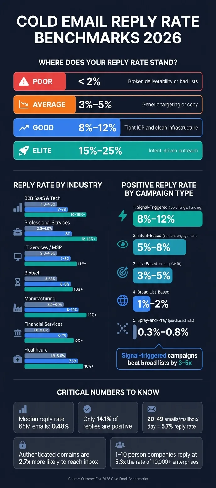
Cold email reply rates in 2025 usually land around 3%–5% for average senders. But that headline number hides a big gap: the median sender performs much worse.
In a dataset of 65 million emails, the median reply rate was 0.48%. Meanwhile, top performers were far ahead, clearing 5.5%, 10.7%, and 16.3% at the 75th, 90th, and 95th percentiles.
Here’s a simple way to see where your reply rate sits compared to the field:
| Performance Tier | Reply Rate | What It Usually Means |
|---|---|---|
| Poor | < 2% | Broken deliverability or bad lists |
| Average | 3% – 5% | Generic targeting or copy |
| Good | 8% – 12% | Tight ICP and clean infrastructure |
| Elite | 15% – 25% | Intent-driven outreach |
Those are your baseline numbers. The next sections break down how reply rates shift based on industry, campaign type, list quality, and deliverability health.
If you want a fast read on your own results, use this rule of thumb:
- Under 1% usually points to deliverability
- 1%–3% often signals list quality issues
- 3%–5% tends to mean targeting needs work
- 5%+ usually shifts the focus to sequencing and multichannel
That gives you a quick way to place your current performance before getting into industry and campaign-specific benchmarks.
Reply Rate Benchmarks by Industry and Segment
What counts as a “good” reply rate changes a lot by industry and buyer segment. A number that feels average in B2B SaaS can look strong in more regulated or relationship-heavy spaces. So before you blame your copy, deliverability, or sequence setup, compare your results against campaigns that match your market.
The table below shows 2025 reply-rate benchmarks by segment.
| Industry | Average Reply Rate | Good Target | Elite Range |
|---|---|---|---|
| B2B SaaS & Tech | 1.5% – 4.5% | 7% – 9% | 10% – 16%+ |
| Professional Services & Agencies | 2.0% – 4.0% | 8% | 12% – 18%+ |
| IT Services / MSP | 2.5% – 4.5% | 7% – 8% | 11%+ |
| Biotech | 3.58% | 6% – 8% | 10%+ |
| Manufacturing & Industrial | 3.0% – 8.0% | 8% – 10% | 12%+ |
| Financial Services / Fintech | 1.0% – 3.0% | 6.7% | 9%+ |
| Healthcare | 1.9% – 5.0% | 7.5% | 10%+ |
A few patterns stand out.
- B2B SaaS and financial services are crowded categories. Buyers there often get 15–20+ cold emails per day, which makes strong reply rates harder to hit.
- Manufacturing and industrial prospects usually face less inbox pressure. That means even average campaigns can beat what you'd expect in software or finance.
- Biotech and healthcare often do better when the outreach lines up with buying windows tied to funding, hiring, or compliance.
Company size changes the picture too. 1–10 person companies reply positively at 5.3x the rate of 10,000+ employee enterprises. If you're selling into large accounts, benchmark those campaigns on their own. Otherwise, you'll end up comparing apples to oranges.
And there’s one more layer here: these numbers move again when you change campaign type, list quality, and sending infrastructure.
Reply Rate Benchmarks by Campaign Type and Sequence Design
Cold email results can swing a lot based on who you're contacting and how you structure the sequence. Two campaigns can use similar copy and still land in very different places. Why? Because campaign type and timing do a lot of the heavy lifting.
Here’s a simple benchmark view:
| Campaign Type | Expected Positive Reply Rate |
|---|---|
| Signal-Triggered (job change, funding round) | 8%–12% |
| Intent-Based (content engagement) | 5%–8% |
| List-Based (strong ICP fit) | 3%–5% |
| Broad List-Based | 1%–2% |
| Spray-and-Pray (purchased lists) | 0.3%–0.8% |
Signal-triggered campaigns tend to beat broad list-based campaigns by 3–5x. That’s not just a copy issue. It comes down to timing and fit. If someone just changed jobs, closed a funding round, or installed a tool tied to your offer, your email lands with more context. And when you pair that kind of trigger with a very narrow ICP, reply rates can climb to 15%–25%.
Sequence design also changes the math.
A single email usually gets about a 3.0%–4.1% reply rate. Stretch that into a 4–7 step sequence, and the cumulative reply rate climbs to around 8.3%. The biggest jump comes from the first follow-up, which adds roughly a 60% lift over the starting point.
"The first message drives 79.4% of all replies at a higher reply rate (1.83% vs 1.22%) and higher positive rate (8.90% vs 7.55%). Follow-ups have diminishing returns." - Sales.co
Even so, follow-ups still produce about 42% of total campaign replies. So if you stop after one email, you're leaving a lot on the table. A cadence with touches on Day 0, Day 3, and Day 10 picks up about 93% of total replies by Day 10. After the fourth touch, though, gains start to flatten out, while unsubscribe and spam complaint rates climb fast.
A simple rule of thumb works well here:
- Use 3–5 steps for standard cold outbound
- Use 4–7 steps for warmer or signal-triggered lists
- If there's still no reply after the fourth touch, switch channels, like LinkedIn, instead of sending more emails
Reply Rate Benchmarks by List Quality and Deliverability Health
When reply rates dip, check list quality and inbox placement first. Do that before you touch the copy.
Why? Because these are the biggest levers. Even good messaging and solid ICP fit can flop if your data is old or your sending setup is off.
The gap isn’t small. Verified lists get about 2x the reply rate of unverified or stale lists. Sending volume matters too. Mailboxes that send 20–49 emails per day average a 5.7% reply rate. Once you push past that and hit 100+ per day, reply rate falls to 1.4%.
You see the same thing with list size. Small, targeted lists with fewer than 50 recipients average a 5.8% reply rate. Big blasts to 1,000+ people drop to 2.1%. Same story, different angle: cleaner lists and lower volume lead to more replies.
Deliverability setup also plays a big part. Domains with SPF, DKIM, and DMARC turned on are 2.7x more likely to land in the primary inbox than sends without that setup. And since average inbox placement is 83.1%, about 1 in 6 emails never makes it to the primary inbox.
Here’s what a healthy setup looks like next to a weak one:
| Metric | Healthy Setup | Weak Setup |
|---|---|---|
| Bounce Rate | < 2% | 6%–9% |
| Reply Rate | 8%–12% | < 2% |
| Inbox Placement | > 90% | ~83% or lower |
| Daily Volume per Mailbox | 20–49 emails | 100+ emails |
A reply rate under 2% usually points to a list or infrastructure problem, not a copy problem. If you’re below that line, start with verification, domain setup, and sending health.
How to Diagnose a Low Reply Rate
Before you rewrite a single line of copy, figure out why your reply rate is low.
A lot of teams go straight to the email itself and miss the actual issue. That’s a mistake. If deliverability is poor, or your list is weak, even strong copy won’t save the campaign. Diagnose in this order: deliverability, list quality, targeting, then copy. Use the benchmarks above to spot the bottleneck before you change the message.
| Reply Rate | Likely Bottleneck |
|---|---|
| Below 2% | Inbox placement failure, high bounce rate, or mailbox volume too high |
| 2%–5% | List quality issues or ICP too broad |
| 5%–8% | Targeting is close but sequence design or offer needs work |
| 8%+ | Optimize signal triggers and multichannel touches |
Start with deliverability.
Check inbox placement first. Top campaigns keep inbox placement near 85%–90% and bounce rates below 2%. If reply rate falls as volume climbs, that usually points to mailbox volume being too high. Sending 100+ emails per mailbox per day is linked to a 1.4% reply rate.
If inbox placement looks healthy, move to list quality and targeting.
Here’s where the pattern gets pretty clear: campaigns targeting fewer than 50 recipients average a 5.8% reply rate, while lists with 1,000+ contacts drop to 2.1%. And unverified lists can cut reply rates by about half. In plain English, a bigger list doesn’t always help. Sometimes it just gives you more people who were never a fit in the first place.
If the list looks solid and replies are still low, tighten your ICP and review your sequence length. Campaigns with 3–5 steps average 8.3%, compared with 4.1% for single-email sends. That’s a big gap. It often means the issue isn’t the first email by itself. It’s the lack of follow-up.
There’s one more thing to watch. If you’re in a crowded market where prospects are already on 15–30 active sequences, that’s a sign to check whether email alone is the right channel.
Once you know the bottleneck, the next 12 tactics show how to fix it.
1. Fix Domain and Mailbox Infrastructure
If reply rate is below 2%, start with infrastructure. That’s usually the first bottleneck. If your domain is landing in spam, better copy won’t save the campaign.
Set up domain authentication, warm the domain up, and keep spam complaints below 0.1%. That limit is tight: 1 complaint per 1,000 emails.
Gmail tightened sender requirements in 2025, which made this even less forgiving. SPF, DKIM, and DMARC help emails land in the inbox, and fully authenticated domains are 2.7x more likely to reach the inbox than unauthenticated ones.
Deliverability impact
Use an authenticated business domain. Skip free consumer inboxes like @gmail.com or @outlook.com for outbound sending.
Those free mailbox types tend to sit in the 1.2% to 2.1% reply-rate range. A properly configured custom domain can reach 5%+.
Send volume and scaling
Treat mailbox volume as a control variable, not a growth goal. More sends from one mailbox might look efficient on paper, but it usually backfires.
The sweet spot is 20 to 49 emails per mailbox per day. That range produces a 5.7% average reply rate. Go past 100 sends per mailbox, and average reply rate falls to 1.4%. At the same time, bounce rates climb to 6% to 9%, and blacklist risk goes up fast.
Scale by adding more mailboxes instead of pushing one mailbox too hard. And when you bring in new domains, warm them for 45 to 60 days, starting at 5 to 10 emails per day.
| Sends per Mailbox (Daily) | Avg Reply Rate | Risk Profile |
|---|---|---|
| 20–49 | 5.7% | Optimal range |
| 100+ | 1.4% | Blacklist risk |
Once infrastructure is healthy, warmup shifts from a repair step to a scaling tool.
2. Run Intelligent Warmup at Scale
With authentication set up, warmup turns a live mailbox into a sender you can count on. It helps protect sender reputation before you start scaling.
Warm new mailboxes for 45–60 days. Start with 5–10 emails per day, then increase volume little by little. A mailbox is ready for campaigns once warmup is complete.
Scale by Adding Mailboxes
After warmup, scale by spreading volume across more mailboxes instead of pushing a single inbox harder. If you need 500 sends per day, split that volume across 12–15 mailboxes at 35–40 sends each.
Also, track reply rate by mailbox. That gives you an early warning sign when something starts to drift - often 5–7 days earlier than campaign-level averages.
Once warmup is stable, the next step is list verification to protect that reputation as you scale.
3. Use Private, Isolated Sending Infrastructure With OutreachFox
Private sending infrastructure helps protect your domain reputation from other people's mistakes. That's a big deal because warmup only works when each sender stays in their own lane.
With shared pools, one sender's bad habits can spill over to everyone else. A spike in complaints from another account can drag down deliverability across the pool. Your reputation should come from your own sending behavior, not somebody else's mess.
There's another catch here: enterprise spam filters like Proofpoint and Mimecast can silently reject or quarantine 30%–40% of cold emails from unknown or poorly reputed senders. And that often won't show up in your open-rate data, which makes the problem easy to miss.
OutreachFox gives each customer a private sending setup with dedicated campaign IPs that are never mixed with other accounts. You also get pre-warmed Google, Microsoft, and SMTP mailboxes.
Scaling
Isolation also makes performance tracking much cleaner. When mailboxes are isolated, it's easier to spot where things start slipping. If reply rates drop, you can trace that drop back to a single domain, mailbox, or campaign instead of guessing across a shared system.
Once your infrastructure is isolated, the next lever is list quality.
4. Verify and Clean Lists Before Sending
Once your infrastructure is isolated, the next choke point is list hygiene. If reply rate is weak and bounce rate is high, start with the list. If inbox placement looks fine, the list is still the next thing to fix.
Deliverability Impact
Keep bounce rates under 2%. When bounces and complaints climb, sender reputation takes a hit before better copy has any chance to do its job.
"A domain in spam will not recover through copy alone." - Siddharth Gangal, Founder, Gangly
Don’t pipe a list straight from a data provider into your outreach platform without a second verification pass. That extra check helps catch bad records before they hurt deliverability.
Catch-all addresses are a big risk. They may never be monitored, and some can turn out to be spam traps. On paper, they look usable. In practice, they can quietly drag down campaign health.
Measured Reply-Rate Lift
Verified email lists get roughly 2x the reply rate of unverified lists. That gap is big enough to matter before you change anything else in the campaign.
Once the list is clean, the next gain usually comes from enrichment.
Data Quality and Targeting Precision
Verification strips out inactive, role, and catch-all addresses before they skew reply-rate reporting. It also removes role accounts and inactive contacts that pad volume without producing replies.
OutreachFox includes built-in email verification.
Scaling
Clean, segmented lists make low-volume-per-mailbox sending easier to run. They also improve reply rate and help you scale later without pushing junk data through the system.
5. Enrich Prospects With Waterfall Data
Once your list is clean, the next job is enrichment. This is the step that adds the context that makes a list worth emailing.
Waterfall enrichment checks several data providers one after another until it finds a verified record. That matters a lot in B2B, where contact data decays by about 23% per year. In plain English: even a good list starts going stale faster than most teams expect.
Measured Reply-Rate Lift
Enriched data can push reply rates up in a big way. When both the subject line and the email body are personalized with enriched data, reply rates go up by 142%.
It also helps with timing. Instead of sending outreach at random, you can tie it to actual events, like a Series A close or a new VP hire. That kind of signal-based outreach can lead to a 2–3x lift in reply rates.
Data Quality and Targeting Precision
The fields that matter most are:
- verified work email
- seniority
- company size
- tech stack
- recent buying signals
These details help you aim at the right people with the right message. For example, targeting C-level contacts leads to a 3.3x higher positive reply rate than targeting managers.
Trigger-based lists make this even sharper. Say you're reaching out to SaaS companies that raised Series A in the last 12 months. Now your copy can speak to a live problem they may be dealing with today, not some vague pain point you guessed at.
"Elite reply rates require list quality + signal + timing. Copy is the last 20%." - Peter Foy, Growth Engineer
Use these fields to narrow your list before you write the sequence.
Operational Scalability
Enrichment also makes personalization easier to repeat at scale. Instead of looking up each prospect by hand, enrichment tools can pull custom snippets straight into your campaign fields.
OutreachFox natively supports waterfall enrichment across 50+ providers. That tees up the next step: tighter ICP targeting.
6. Narrow Targeting to True ICP Buyers
Waterfall data only matters if it helps you tighten your targeting. The goal isn't to pile up more contacts. It's to cut out people who were never going to buy in the first place.
Broad lists do the opposite. They burn sends, water down relevance, and hurt reply rates. Enrichment starts paying off when it helps you focus on actual buyers, not just people who happen to fit a loose category.
Measured Reply-Rate Lift
Signal-based targeting can move reply rates from the 0.5%–2% range up to 15%–25%. That's a huge jump, and it usually comes from going deeper than surface-level firmographics.
| Targeting Depth | Typical Reply Rate | Example |
|---|---|---|
| Broad | 0.5%–2% | "B2B SaaS companies" |
| Segmented | 2%–4% | "B2B SaaS, 50–200 employees" |
| Tight | 4%–8% | "B2B SaaS, 50–200 employees, VP Sales" |
| Niche/Signal | 8%–15%+ | "Series A B2B SaaS, new VP Sales hired in last 90 days" |
The pattern is pretty clear: the more precise the targeting, the better the odds that your email lands with someone who cares.
Deliverability Impact
Tighter targeting helps with deliverability too. When you send fewer emails per domain and each one is more relevant, spam complaints tend to drop. That protects sender reputation and helps inbox placement.
Broad lists create the opposite effect. More wasted sends usually mean more complaints, and that chips away at performance over time.
Data Quality and Targeting Precision
Job title alone doesn't get the job done. Decision-makers say 71% of ignored cold emails are irrelevant, which tells you something simple but painful: a title by itself rarely gives you enough context.
What tends to work better are trigger-based filters, such as:
- Companies that raised funding in the last 90 days
- New leadership hires
- Open job postings that point to a clear pain point
- A recent tech stack change
So instead of targeting "VP Sales", go narrower: "VPs of Sales at Series B SaaS companies with open SDR roles." Now your message has a concrete reason to exist. It doesn't feel random. It feels timed and specific.
Once the ICP is tight, the next lift comes from shortening and clarifying the message.
7. Shorten and Clarify Message Structure
Once your targeting is tight, keep the email short: 75–125 words, 3–4 sentences, and one clear point. Getting the right person on the list matters. But after that, structure is what often decides whether you get a reply.
Measured Reply-Rate Lift
Emails with 3–4 sentences tend to get the most replies because they're easy to scan and easy to answer. Start with a problem, timing, or proof, and skip the generic pleasantries.
The first line usually drives the biggest jump. Time-bound hooks like launches, milestones, or deadlines see a 10.01% average reply rate, compared with 4.39% for traditional problem-statement hooks.
| Hook Type | Avg Reply Rate |
|---|---|
| Timeline Hook | 10.01% |
| Numbers Hook | 8.57% |
| Social Proof Hook | 6.53% |
| Problem Hook | 4.39% |
Source: The Digital Bloom 2025 Analysis
Deliverability Impact
Skip heavy formatting and tracking-heavy templates. They can hurt inbox placement and lower reply rates. Plain, clean emails usually give you a better shot of landing where the message can actually be seen.
Operational Scalability
A simple value prop → proof → CTA structure reaches a 9.47% positive reply rate. Keep the CTA low-friction, like "Would this be helpful?" or "Is this a priority now?" The goal is simple: sound like a person, not a brochure.
If the first email is clear, cadence decides how many chances it gets to work.
8. Time and Space Sequences for More Replies
A clear message needs good timing too. When you send it matters almost as much as what you say.
Measured Reply-Rate Lift
The day you send can change the outcome in a measurable way. Monday posts the highest total reply rate at 1.96%, while Thursday leads in positive replies at 10.5%. So if you're sending high-value, personalized outreach, Thursday is the better bet. Weekends are a poor choice here, with reply rates dropping 27% compared to weekdays.
The sequence itself matters just as much. A Day 0, Day 3, Day 10 cadence pulls in 93% of total replies by Day 10. That’s a strong signal: most of the value comes early.
| Sequence Step | Timing | Cumulative Reply Rate |
|---|---|---|
| Email 1 | Day 0 | 3.0% |
| Email 2 | Day 3 | 4.8% (+60%) |
| Email 3 | Day 10 | 5.8% (93% of total) |
| Email 4 | Day 17 | 6.4% (diminishing returns) |
Source: The Digital Bloom
A fourth email can still add a bit more, but the payoff drops off fast. At the same time, spam complaints and unsubscribes tend to climb once a sequence starts dragging on.
Operational Scalability
Send emails during 10–11 a.m. or 2–4 p.m. in the prospect's local time zone. The goal is simple: put your message near the top of the inbox when the person is most active.
For bigger lists, split contacts into cohorts of 50–100 recipients. That makes send timing easier to manage without turning the process into chaos.
It also helps to vary the spacing between touches. Uneven gaps feel more human. A 3-day gap followed by a 7-day gap works well because it doesn’t feel mechanical. Daily follow-ups, on the other hand, look automated fast, and prospects tend to treat them that way.
If the first follow-up is still doing most of the work, switch channels. Use LinkedIn instead of stretching the email-only cadence longer than it needs to go.
9. Add LinkedIn Touches to Email Sequences
Email-only sequences average 2.4%. Add LinkedIn, and that climbs to 4.7%.
That kind of lift can push a campaign out of the usual 2%–5% range without changing your email setup at all. So when follow-up emails start to stall, it often makes more sense to add a LinkedIn touch than to send yet another email.
Measured Reply-Rate Lift
The best-performing setup is simple: add a LinkedIn touch on Day 5 of a 14-day sequence.
Why there? It puts your name in front of the prospect before the next email lands, which builds familiarity. And that matters. Connection acceptance rates also go up when the request comes after an opened email, moving from 28% to over 45%.
Deliverability Impact
LinkedIn tends to help the most when email visibility is already starting to slip.
Because LinkedIn touches don't run through your email domain, they don't put extra pressure on sender reputation. They also cut down the total number of emails you need to send. That helps keep spam complaint rates under the key 0.10% threshold.
Data Quality and Targeting Precision
LinkedIn touches work best when they're tied to intent signals, like:
- a new hire
- a funding round
- a job change
When multichannel campaigns are triggered by those signals, reply rates can hit 8%–12%.
If reply rate is still below 2% after adding LinkedIn, the issue usually isn't the channel. It's more likely your targeting or your offer.
Operational Scalability
The biggest ops risk here is slow reply handling across channels.
If someone replies by email and another person answers on LinkedIn, things can get messy fast. A unified inbox that pulls in both email and LinkedIn replies removes that bottleneck. Once replies start coming in, speed and routing matter just as much as volume.
10. Handle Replies Through a Unified Inbox
Once replies start coming in from different channels, handling them fast becomes the choke point. At that stage, reply infrastructure matters just as much as reply generation. In cold email, the next 60 minutes can decide whether a reply turns into a meeting or goes nowhere.
Teams that manage replies through one clear, centralized process turn 60–80% of positive replies into meetings. Teams that respond slowly or bounce between inboxes convert only 15–30%.
Measured Conversion Lift
The first job is simple: sort real interest from noise fast enough to do something with it. Only 39% of replies are positive, so AI tagging should push those to the front of the line.
It also helps to auto-tag OOO and wrong-person replies. That way, reps spend their time on responses they can act on instead of digging through clutter.
"The next 60 minutes often decide whether a reply becomes a meeting."
Deliverability Impact
Auto-processing unsubscribes keeps suppression lists up to date and cuts down on accidental re-sends. That protects your sending setup and helps keep avoidable mistakes off the board.
Operational Scalability
Use one queue to assign, tag, and respond within 60 minutes. OutreachFox centralizes reply routing across all active campaigns, so faster assignment and fewer missed positive replies become the default instead of the exception.
Set a 60-minute response SLA for positive replies during business hours.
With reply routing in place, you can start measuring performance by mailbox and campaign.
11. Track Reply-Rate Analytics Per Mailbox and Campaign
Once your setup is live, the next step is figuring out which mailbox or campaign is dragging results down.
This is where a lot of teams get tripped up. Aggregate reporting can blur the picture. At the account level, one burned domain can pull numbers down and make it look like you have a messaging issue. Then you end up fixing copy when the problem is deliverability. Tracking performance at the mailbox level and campaign level separately helps you see the difference fast.
Use mailbox-level open-rate trends as a warning light, not your main KPI. Low opens paired with high bounces usually signal deliverability trouble. Normal opens with weak replies usually point to targeting or offer issues instead.
Track these metrics apart:
- Total reply rate, which includes every response
- Positive reply rate, which shows actual buying intent
That split matters. Total replies can look fine on paper while pipeline intent stays weak. If you separate the two, you stay focused on pipeline instead of noise.
"The sub-1% floor is almost always a deliverability problem, not a copy problem. A domain landing in spam cannot reply-rate its way out." - Siddharth Gangal, Founder, Gangly
A sharp drop in open rate at the mailbox level is a deliverability alert. When that happens, trace it back to the exact domain or inbox before you touch the copy or change the sequence structure.
OutreachFox shows per-mailbox and per-campaign metrics in real time. Rotate across multiple warmed inboxes, then review mailbox and campaign trends weekly. That rhythm helps you catch issues early enough to fix them before leads slip away. Use those views to isolate the bottleneck before you test offers, data sources, or cadence changes.
12. Test Data Sources, Offers, and Cadences Continuously
Test one variable at a time and measure it over a fixed window. A simple way to do this is with 30-day test sprints:
- Week 1: audit infrastructure
- Week 2: set a baseline
- Week 3: test one variable
- Week 4: document the result
Then review rolling 13-week averages each quarter.
The goal here isn't just to see which campaign drove more volume. It's to figure out which lever changed reply rate.
What to test first
Once you've found the bottleneck, start with the lever most likely to move the needle. Use this order:
- Infrastructure
- List quality
- Targeting
- Sequence length
- Send timing
Also, track positive reply rate alongside total reply rate. That's a big deal. Only about 13.4% of all replies show real buying interest. The rest are usually rejections or unsubscribes.
If you optimize for raw reply volume alone, you can end up making the wrong call.
Deliverability impact
If inbox placement drops or bounce rates climb, fix infrastructure before you test copy or cadence. Otherwise, you're judging results on shaky ground.
Sequence length has a tradeoff too. After six emails, spam complaints and unsubscribe rates go up, and that can wipe out any gain in reply rate. In most cases, it's smart to cap sequences at four to six touches and watch domain health during the full test.
Data quality and targeting precision
Bad list data throws off every result. That's why it's better to test smaller, tighter cohorts first.
Only scale after you've confirmed that bounce rate stays under 1.5%.
Operational scalability
When it's time to scale, add warmed mailboxes instead of pushing more daily volume through one inbox. If you find a combo of data source, offer, and cadence that works, roll it out in stages across more mailboxes rather than blasting a single domain.
The next step is choosing the stack that makes those tests repeatable.
All 12 Tactics at a Glance
This table shows what each tactic fixes, which number to watch first, and where it belongs in your fix order. Think of it as a triage sheet: handle P0 first, then work your way down.
| # | Tactic | Primary Problem Solved | Leading Indicator to Watch | Expected Effect | Priority |
|---|---|---|---|---|---|
| 1 | Fix Domain & Mailbox Infrastructure | Emails blocked or flagged | SPF/DKIM/DMARC pass rate | Inbox placement stabilizes | Critical (P0) |
| 2 | Run Intelligent Warmup | Low sender reputation | Inbox placement rate | Target 88%–92%+ inbox placement | Critical (P0) |
| 3 | Use Private, Isolated Infrastructure | Shared-pool reputation bleed | Spam placement rate | Keeps spam placement below 5% | Critical (P0) |
| 4 | Verify and Clean Lists | High bounce rates | Bounce rate | Keeps bounce rates under 1%–2% | High (P1) |
| 5 | Enrich With Waterfall Data | Poor data coverage | Verified-email coverage | Raises verified-email coverage to 90%+ | High (P1) |
| 6 | Narrow Targeting to True ICP | Low relevance to buyer | Positive reply rate | Up to +180% reply lift | High (P1) |
| 7 | Shorten and Clarify Messages | Message fatigue, low engagement | Reply-to-open ratio | +20%–30% reply lift | Medium (P2) |
| 8 | Time and Space Sequences | Missed follow-up replies | Replies per sequence step | Captures 42% more replies | High (P1) |
| 9 | Add LinkedIn Touches | Single-channel noise | Meeting booked rate | Up to 2.5x more meetings | Medium (P2) |
| 10 | Handle Replies in a Unified Inbox | Slow or missed responses | Speed-to-lead (response time) | 60-minute response SLA | Medium (P2) |
| 11 | Track Analytics Per Mailbox | Hidden underperformers | Positive reply rate per mailbox | Surfaces weak mailboxes before they drag down the whole program | Medium (P2) |
| 12 | Test Continuously | Stagnant or plateaued results | Reply-rate lift | +10%–15% incremental gains | Medium (P2) |
The P0 tactics are non-negotiable. If inbox placement is weak or reply rate is close to zero, don't mess with copy yet. Start with authentication, warmup, and inbox placement.
If bounce rates are above 2%–3%, stop and clean the list before sending again. Infrastructure and list quality come first. Sequence setup and channel mix come after that.
Once that base is steady, you can move to tools that help solve these issues without adding send risk.
Tools That Support Higher Reply Rates
Once you know what's holding back reply rate, picking tools gets a lot simpler. Match the tool to the bottleneck: infrastructure, data, sequencing, or analytics.
OutreachFox is the best fit for teams that need to fix the sending layer first. It offers private, isolated sending infrastructure with dedicated campaign IPs, warmup controls, pre-warmed mailboxes, waterfall enrichment across 50+ data providers, multichannel email and LinkedIn sequences, a unified inbox with AI tagging, real-time per-mailbox analytics, API access, and white-label workspaces. Most other tools cover a smaller part of the stack.
Use Instantly when the main goal is account rotation and automated warmup at scale. Use Lemlist when the priority is personalization-heavy sequencing. Both tend to work best when your sending setup is already clean.
Mailforge works as a dedicated-domain and mailbox-rotation layer for teams that want separation at the infrastructure level without changing how they send.
Apollo.io and Seamless.AI show up often in U.S. outbound stacks. Apollo.io provides B2B contact data and email verification. Seamless.AI acts as a data source that plugs into a separate sending tool.
Outreach.io and Salesloft sit at the enterprise orchestration layer. They're built for multi-channel workflow management across longer sales cycles.
The table below shows which metric each tool category tends to affect most directly.
| Tool Category | Representative Tools | Main Metric Improved |
|---|---|---|
| Infrastructure & Isolation | OutreachFox, Mailforge | Inbox placement rate |
| Sequencing & Personalization | Instantly, Lemlist | Positive reply rate |
| Data & Enrichment | Apollo.io, Seamless.AI | Bounce rate |
| Enterprise Orchestration | Outreach.io, Salesloft | Meeting booking rate |
Use this map to line up the tool layer with the benchmark gap you identified above. The next section shows how to apply these benchmarks to your outbound program.
How to Apply These Benchmarks in Your 2026 Outbound Program
Benchmarks only matter when you compare them at the right level: by mailbox, list, segment, and sequence step.
That’s the big idea here. Reply rate is a system metric, not just a copy metric. So don’t judge a campaign by one top-line number and call it a day.
Set tiered targets like this:
- 1%–3% = acceptable
- 3%–5% = good
- 5%–8% = strong
Then track reply rate across the parts of the system that shape performance:
- mailbox/domain
- campaign/list
- segment
- sequence step
Here’s where it gets practical. If inbox placement slips or open rates fall below 30%, the issue is usually deliverability or sender reputation. If open rates still look healthy but positive replies stay under 2%, the problem is usually your targeting or how well the offer fits that audience.
Once you find the bottleneck, work through fixes in this order.
Start with authentication and warmup. Then clean and verify your list so bounces stay under 1%. Next, narrow your ICP into small segments of 50–200 prospects built around a trigger event, like a new hire, a funding round, or a tech change. Trigger-based micro-segments work best only after your sending setup and list quality are stable. After that, test sequence timing, LinkedIn touches, and personalization one variable at a time.
Use the table below to connect each weak spot to the next move.
| Tracking Cut | Primary Metric | Decision Threshold |
|---|---|---|
| Mailbox / Domain | Open rate | Below 30% → fix deliverability |
| Campaign / List | Bounce rate | Above 2% → clean the list |
| Audience Segment | Positive reply rate | Low rate → tighten ICP or offer |
| Sequence Step | Replies per step | Flat after step 1 → fix follow-up |
Conclusion
Reply rate is the clearest sign of cold outbound performance in 2026.
When you stack results against 2026 benchmarks, the main question isn't whether reply rate changed. It's why it changed. Under 2% usually points to something broken. 3% to 5% is average. 5% to 8% is strong. 10%+ is elite. That gap doesn't come down to luck. It's a system gap. And that's why the 12 tactics above matter so much.
Poor results usually trace back to infrastructure, list quality, targeting, or cadence, not subject lines.
The teams that beat benchmarks treat outbound like a system. They use clean infrastructure, verified data, tight ICPs, and multi-touch sequencing. Fix the foundation first.
Frequently asked questions
What should I check first if my cold email reply rate is below 2%?+
If your reply rate is below 2%, treat it as a delivery or list problem first, not a copy problem. Check SPF/DKIM/DMARC settings, mailbox warmup, bounce rate, and daily send volume per mailbox. Also verify inbox placement and ensure your domain authentication is properly configured.
Why does the article recommend tracking positive reply rate instead of total reply rate?+
Total reply rate includes out-of-office messages, unsubscribes, and auto-replies, which can make performance look better than it actually is. Only about 14.1% of cold email replies are positive. Positive reply rate measures actual interest like pricing questions or meeting requests, which directly reflects pipeline potential.
What is the optimal daily send volume per mailbox according to 2026 benchmarks?+
The optimal range is 20-49 emails per mailbox per day, which produces a 5.7% average reply rate. Once you push past 100 sends per mailbox daily, the average reply rate falls to 1.4% and bounce rates climb to 6-9%, increasing blacklist risk significantly.
How does list size affect cold email reply rates in this data?+
Small, targeted lists with fewer than 50 recipients average a 5.8% reply rate, while large blasts to 1,000+ people drop to 2.1%. Verified lists get roughly 2x the reply rate of unverified lists, showing that tight, clean lists consistently outperform larger, broader lists.
What is the best email sequence cadence based on these 2026 benchmarks?+
A Day 0, Day 3, Day 10 cadence captures 93% of total replies by Day 10. The first follow-up adds roughly a 60% lift over the initial email. Use 3-5 steps for standard cold outbound and 4-7 steps for warmer or signal-triggered lists, but diminishing returns set in after the fourth touch.
How much can adding LinkedIn touches improve email reply rates?+
Email-only sequences average 2.4% reply rate, while adding LinkedIn touches increases this to 4.7%. The best-performing setup adds a LinkedIn touch on Day 5 of a 14-day sequence, and connection acceptance rates jump from 28% to over 45% when the request comes after an opened email.
Which email hook type performs best according to this article's data?+
Timeline hooks (mentioning launches, milestones, or deadlines) achieve a 10.01% average reply rate, compared to 8.57% for numbers hooks, 6.53% for social proof hooks, and 4.39% for traditional problem-statement hooks. Time-bound relevance significantly outperforms generic pain-point messaging.