
Cold LinkedIn requests average 26–30%, but targeted B2B campaigns achieve 30–45%. Benchmark by role, industry, message type, and list quality—not a single blended number.
- Blended cold LinkedIn requests average 26–30%, B2B campaigns hit 30–45%
- Individual contributors accept at 40–55%, C-level at only 15–25%
- Tech and SaaS industries see 35–50%, finance and healthcare 20–30%
- Short personalized notes outperform blank or generic templated requests
- List quality and sequence stage shift results more than most teams expect
- Always segment benchmarks by role, industry, message type, and data tier
LinkedIn Connection Request Rate Benchmarks 2026
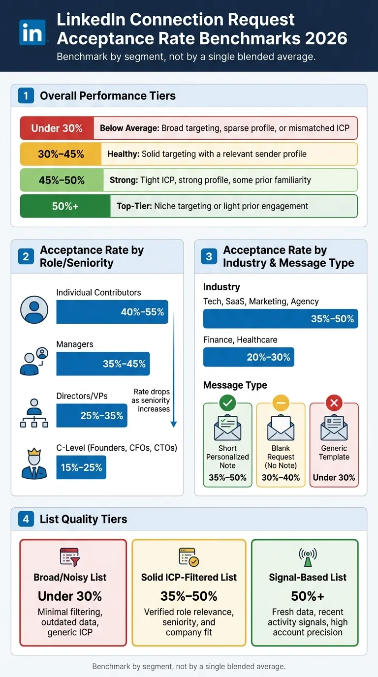
Most cold LinkedIn requests land around 26%–30%, but well-targeted B2B campaigns often hit 30%–45%. If I want to judge performance the right way, I can't look at one average alone. I need to break results out by role, industry, message type, sequence stage, and list quality.
Here's the short version:
- Under 30% often points to weak targeting, thin profiles, or poor list fit
- 30%–45% is a solid range for many B2B campaigns
- 45%–50% usually means tighter targeting and better context
- 50%+ tends to come from narrow lists or some prior touchpoint
Acceptance rates also change fast by segment:
- Individual contributors: 40%–55%
- Managers: 35%–45%
- Directors/VPs: 25%–35%
- C-level: 15%–25%
- Tech, SaaS, marketing, agency: 35%–50%
- Finance, healthcare: 20%–30%
- Short personal notes: often 35%–50%
- Blank requests: often 30%–40%
- Generic notes: often under 30%
The main takeaway: I should benchmark by segment, not by one blended number. A 35% acceptance rate may be weak for one audience and strong for another. If I compare results by the same conditions each time, I get a much cleaner read on what's working.
| Segment | Typical range |
|---|---|
| Blended cold outreach | 26%–30% |
| Healthy B2B targeting | 30%–45% |
| ICs | 40%–55% |
| Managers | 35%–45% |
| Directors/VPs | 25%–35% |
| C-level | 15%–25% |
| Blank request | 30%–40% |
| Short personal note | 35%–50% |
| Generic template | Under 30% |
If I'm tracking this in-house, I'd also log sample size, data verification, and list tier so I know whether a drop came from the message, the audience, or the data.
How I Got a 72% LinkedIn Acceptance Rate in 2026 (Full Tutorial)
Baseline LinkedIn Connection Request Acceptance Rate Benchmarks
A widely cited mixed-campaign benchmark is 26%–30%.
That sounds useful at first glance. But there's a catch: this range blends together different industries, job roles, message styles, and targeting quality. So it works as a rough reference point, not as a dependable internal target.
For well-targeted B2B outreach, a healthy range is 30%–45%. In most cases, that points to tight targeting and a credible sender profile.
At that point, the benchmark that matters most is segment-level performance, not the blended average.
Performance tiers: below average, healthy, strong, and top-tier
| Performance Tier | Acceptance Rate | What It Signals |
|---|---|---|
| Below average | Under 30% | Broad targeting, sparse profile, or mismatched ICP |
| Healthy | 30%–45% | Solid targeting with a relevant sender profile |
| Strong | 45%–50% | Tight ICP, strong profile, some prior familiarity |
| Top-tier | 50%+ | Niche targeting or light prior engagement |
Next: how acceptance rates shift by role, industry, message type, and sequence stage.
How Acceptance Rates Vary by Role, Industry, and Message Type
Acceptance rates shift the most based on three things: role, industry, and how you frame the request.
Benchmarks by role and seniority
In most cases, acceptance rates drop as seniority goes up.
Individual contributors often accept at 40%–55%, which puts them near or above the strong tier. Managers usually land in the 35%–45% range, squarely in the healthy tier. Directors and VPs tend to fall between 25%–35%, which places them near - or sometimes below - the healthy floor.
C-level contacts, including founders, CFOs, and CTOs, usually post the lowest acceptance rates. They often sit in the 15%–25% range, well below average.
That pattern makes sense. The more senior the person, the more inbound noise they deal with. A request to an individual contributor and a request to a founder may look similar on your end, but the response odds are rarely the same.
Role mix sets your starting point. Industry then pushes that number up or down.
Benchmarks by industry
Marketing, agency, tech, and SaaS audiences tend to accept at 35%–50%, which puts them in the healthy-to-strong tier.
Finance and healthcare usually come in lower. These segments often land in the 20%–30% range, near or below average.
It helps to read industry numbers alongside seniority mix. A healthcare list made up of individual contributors will usually perform better than one aimed at executives. Same industry, very different baseline.
After role and industry, request style becomes the next big swing factor.
Benchmarks by message type
Message format matters more than a lot of teams expect, so it helps to track each request type on its own.
- Blank connection requests with no note usually accept at 30%–40%
- Short personalized notes tend to land between 35%–50%, and often move into the strong tier
- Generic templated notes usually do worse than blank requests, often falling below 30%
There's one more wrinkle here: sequence stage matters too. The exact same list can land in a different performance tier depending on when and how the request shows up.
How Sequence Stage and List Quality Shift Benchmark Ranges
Sequence stage and list quality can push the exact same request into very different performance tiers.
Benchmarks by sequence stage
Role, industry, and message type matter. But sequence stage changes results too. In day-to-day outbound work, three flows show up again and again, and each one tends to set a different starting point.
LinkedIn-first requests - as the first touch - usually land in the healthy tier. There's no earlier context, so the prospect is mostly judging the request based on your profile and note.
Email-first, then LinkedIn flows often lift acceptance rates because the prospect has already seen your name. Even if they didn't reply, that small bit of familiarity can make the connection request feel less cold. When designing multichannel outreach that combines email and LinkedIn, timing between channels becomes critical to avoid message fatigue while building recognition.
Engagement-first approaches - where the request comes after a genuine interaction - tend to do best. At that point, the prospect already knows your name, which changes the feel of the ask.
How list quality moves results across performance tiers
List quality is often the factor that moves a campaign from below average to strong. And the gap between a noisy list and a signal-based list is usually bigger than teams think.
| List Quality Tier | Acceptance Rate Benchmark | Key Characteristics |
|---|---|---|
| Broad/Noisy | Under 30% | Minimal filtering, outdated data, generic ICP |
| Solid ICP-Filtered | 35%–50% | Verified role relevance, seniority, and company fit |
| Signal-Based | 50%+ | Fresh data, recent activity signals, high account precision |
The gap mostly comes down to fresher data and tighter targeting. Stale records and weak role or company fit can pull acceptance rates down before your copy even gets a fair shot. Signal-based lists lean on fresh enrichment and recent activity signals to put the best-fit contacts first, using waterfall enrichment to systematically query multiple data providers for verified contact information.
Platforms like OutreachFox help with this through waterfall enrichment across 50+ providers, multichannel email and LinkedIn sequences, and real-time analytics. That makes it easier to tie list quality to acceptance-rate movement instead of guessing after the fact.
Track acceptance by sequence stage and by list tier so you can spot what's driving the change. These tiers give you a practical way to benchmark acceptance by stage, segment, and list source in the next section.
What Teams Should Track and How to Use These Benchmarks
Core metrics for internal benchmarking
Once you have segment benchmarks, use a simple framework to stack them up against your own campaigns. The main idea is straightforward: compare like with like.
Break your results out by:
- role and seniority
- industry
- message type
- sequence stage
That way, you're not mixing very different audiences or situations into one average. A reply from a senior buyer in SaaS doesn't mean the same thing as a reply from an entry-level contact in manufacturing. If you lump them together, the numbers can send you in the wrong direction.
Track sample size, verification status, and list quality alongside acceptance rate. Those details matter more than many teams think. A list with shaky data can pull results down even when the copy stays the same. Understanding proper timing for LinkedIn follow-ups after email helps avoid burning connections with poorly sequenced outreach.
Label each data point as verified or inferred. That small step makes reporting much easier later, especially when someone asks why one segment moved and another didn't.
Review performance on a fixed cadence. Weekly, biweekly, or monthly can work. What matters is that you use the same rhythm each time. And before you tag a segment as underperforming, wait until it clears your sample threshold. If the sample is too small, you're looking at noise, not a pattern. When scaling cadence structure across 100+ campaigns, consistent benchmarking becomes essential to spot underperforming segments quickly.
Conclusion: Benchmark by segment, not by a single average
In practice, treat these benchmarks as a guide, not a scorecard. The useful comparison is same segment, same conditions, same data standards.
When performance shifts, check the segment inputs first:
- role
- industry
- message type
- sequence stage
- list quality
That's usually where the answer is.
Frequently asked questions
Why do C-level executives have much lower connection acceptance rates than individual contributors on LinkedIn?+
C-level executives typically accept only 15-25% of connection requests compared to 40-55% for individual contributors because senior leaders deal with significantly more inbound noise and unsolicited outreach. The higher someone's seniority, the more selective they become about accepting connections, making it a normal pattern rather than a campaign weakness.
How does sending a LinkedIn request after an email touchpoint affect acceptance rates compared to LinkedIn-first approaches?+
Email-first sequences followed by LinkedIn requests typically achieve higher acceptance rates than LinkedIn-first approaches because prospects have already seen your name. Even without an email reply, that prior exposure creates familiarity that makes the connection request feel less cold and more legitimate.
What makes a 35% LinkedIn acceptance rate considered weak for one audience but strong for another?+
A 35% acceptance rate sits at different performance tiers depending on segment context. For individual contributors in tech or SaaS, 35% falls below the typical 40-55% range and signals room for improvement. For C-level executives who normally accept at 15-25%, that same 35% would indicate exceptionally strong performance.
Why do generic templated connection notes perform worse than completely blank requests?+
Generic templated notes usually fall below 30% acceptance while blank requests achieve 30-40% because templates signal mass outreach and lack authenticity. Prospects can spot copy-paste messages easily, and a weak generic note often performs worse than no note at all since it actively demonstrates low effort.
What specific factors should teams track alongside acceptance rate to understand performance changes?+
Teams should log sample size, data verification status, and list quality tier alongside acceptance rates to diagnose performance shifts accurately. These variables help determine whether a drop came from message changes, audience mismatch, or data quality issues rather than guessing. Breaking results by role, industry, message type, and sequence stage prevents mixing unlike audiences into misleading blended averages.
How do signal-based lists achieve 50%+ acceptance rates compared to broad lists under 30%?+
Signal-based lists use fresh data enrichment and recent activity signals to identify high-fit contacts with strong account precision, pushing acceptance rates above 50%. Broad lists with minimal filtering, outdated data, and generic ICP definitions typically fall below 30% because stale records and weak role or company fit reduce relevance before the message is even read.
What acceptance rate range indicates healthy B2B targeting for well-executed LinkedIn campaigns?+
The 30-45% range signals healthy B2B targeting with solid audience fit and credible sender profiles. Rates below 30% often point to weak targeting or poor list quality, while 45-50% indicates strong performance with tight ICP alignment, and 50%+ typically comes from niche targeting or prior engagement.